The Busara Clinical Decision Making Framework Deliberative phase – Part 3 – Pairwise Comparisons

Review

The Busara Clinical Decision Making Framework (BCDMF) deliberative phase is designed to be used when decision makers are not ready to make a decision after examining decision-related data and tradeoffs intuitively. Use of the deliberative phase should be considered anytime decisions present difficult tradeoffs and/or when making high stakes decisions, particularly those that cannot be reversed, such as having surgery. 

The BCDMF is based on multi-criteria decision analysis (MCDA). MCDA is designed to help people make better choices when decisions involve tradeoffs between competing decision objectives, a characteristic of many medical decisions. There are a number of well developed MCDA methods. They all use the same basic decision model but differ in the method used to identify preferred alternatives. A nice feature is that the methods can progressively build on each other, so it is possible to increase the complexity of an analysis without needing to start over. [1]

The methods included in the Busara Clinical Decision Making Framework are listed in the following table. They can be applied to both assessing the relative priorities of the decision criteria and how well the options meet the criteria. 

All of these methods work by creating quantitative scales that reflect decision makers judgments about how well the options meet the criteria and the priorities of the criteria relative to the goal. These scales help characterize the judgments being made in the decision making process more exactly than possible using qualitative terms or intuitive feelings. They therefore provide a new and enhanced way for decision makers to  communicate with each other about their preferences and priorities. They also enable decision makers to explore how changing their initial preference and priority judgments affects the overall assessments of the options under consideration. 

Pairwise Comparisons

The BCDMF pairwise option approach reduces the decision judgments to their simplest form: a single judgment between just two of the decision elements (options or criteria). This approach is used in the Analytic Hierarchy Process (AHP) a well-known decision making method. 

The advantage of the pairwise method is that it focuses attention on each individual component of the decision. In doing so, it provides a fundamentally different way of thinking about the tradeoffs and judgments involved in making a decision than the other methods included in the BCDMF (and many other formal decision making techniques). This difference can help decision makers gain additional insight into the decision at hand and help them refine their personal preferences and priorities. The disadvantage of the method is the inevitable increase in the number of discreet judgments that must be made if the decision is broken down so completely. 

The benefit of the approach depends on whether the additional insight is worth the additional work involved. Examples include situations where a clear best choice has not emerged after using the other methods provided in the framework and when making a particularly high stakes decision, where the role of a good decision making process is paramount. A good way to use the pairwise comparison format is to minimize the work involved by using the earlier steps in the process to highlight the key features of the decision and identify a short list of options that are worth further in-depth analysis.

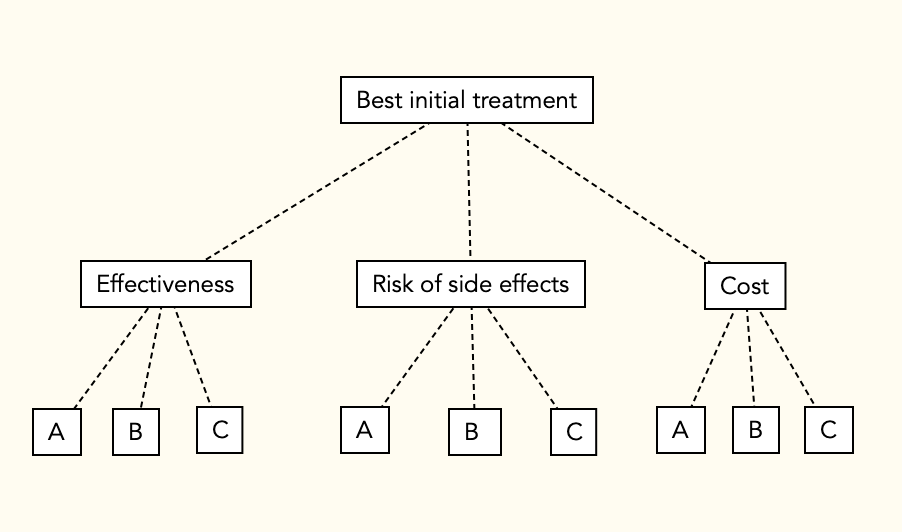
To illustrate, let’s continue to use the example scenario where a doctor and a patient named Anna are choosing among 3 possible treatment options using the following decision model. 

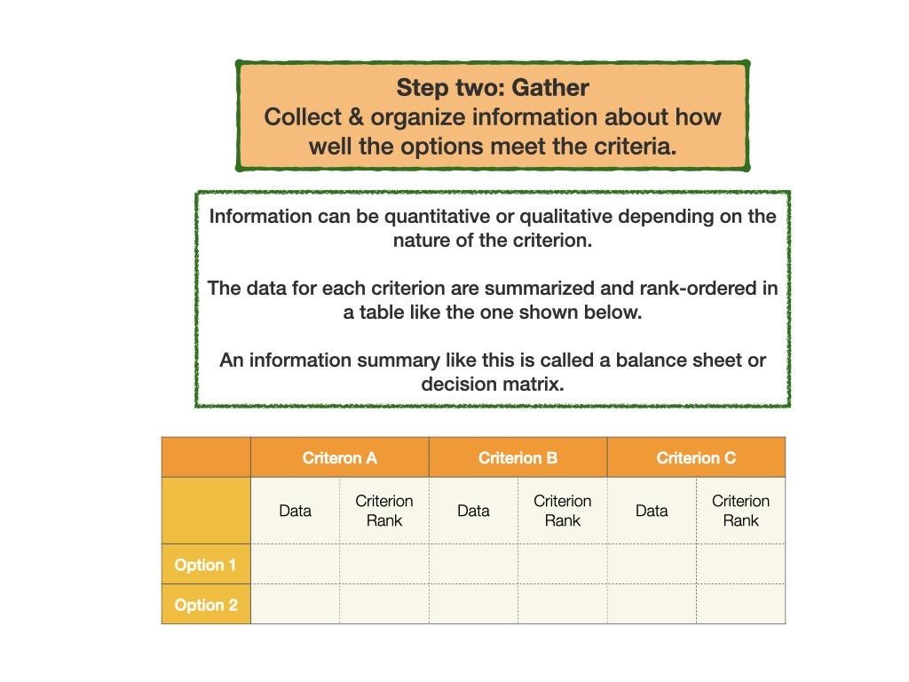
They collect data summarizing how well each option will fulfill each of the three decision criteria:

They then evaluate the options and prioritize the criteria using both ordinal rank weights and direct weights, as explained in the last two Musings. The results are summarized below:

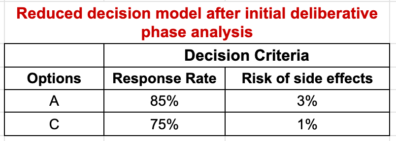
Now let’s assume that on the basis of the analysis so far, Anna eliminates Option B from consideration but is still unsure whether she prefers Option A, which is better in terms of effectiveness, or Option C, which is the safer option. She also decides to eliminate the cost criterion, since she can afford both of them equally well. The resulting decision matrix is shown below: 

Anna and her physician then decide to use the Pairwise Comparison technique to take a closer look at the differences between these two options. For the judgments regarding how well the options fulfill the criteria, the first step is to decide if the two options are equivalent. If not, the preferred option is identified and the strength of preference judged on a four-point scale: slight (2), moderate (3), strong (4), or very strong (5). These judgments are then entered into a judgment table or matrix. With only two comparisons, this is a 2×2 table. Each row show the relationship between the Row option and the Column option:

Option scores are calculated by normalizing the geometric means of the row totals. The comparisons between the criteria are made the same way with the judgments made in terms of how important each is relative to the goal of the decision.

The judgments required for Anna’s analysis are summarized below:

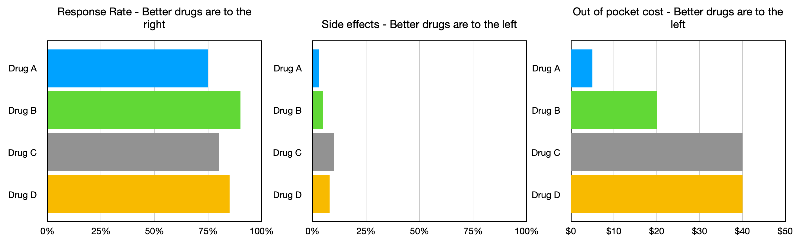
  • Response Rate: Option A (85%) vs Option C (75%)
  • Risk of Side Effects: Option A (3%) vs Option C (1%)
  • Response Rate vs Risk of Side Effects relative to the decision goal

Let’s assume that  Anna moderately prefers A to C relative to Response Rate, slightly prefers C to A relative to Side Effects, and judges Response Rate moderately more important than risk of Side Effects relative to the decision goal. The resulting comparison tables, geometric means, and scores are shown below:

The final results are calculated using the weighed average method, just like the ordinal rank weighting and direct weighting methods: overall scores are calculated for each option by multiplying the option criteria weights times the criteria priorities and summing the results. To make it easier to review and discuss the scores, they are multiplied by 100 to remove the decimal places.

Musings

Although this and the other deliberative methods I have described seem complicated, that is only because I have been explaining how things work “under the hood”. Once the calculations are programmed into a suitable app or spreadsheet, the process only requires attention to the judgments being made. 

As I mentioned previously, another advantage of the quantitative deliberative methods is the ability to determine how changes in judgments would affect the final results. The ability to ask “what if” can add a great deal of insight into the key aspects driving a decision. 

References

1. Dolan JG. Multi-Criteria Clinical Decision Support: A Primer on the Use of Multiple-Criteria Decision-Making Methods to Promote Evidence-Based, Patient-Centered Healthcare. The Patient: Patient-Centered Outcomes Research. 2010 Dec;3(4):229–48.

The Busara Clinical Decision Making Framework Deliberative phase – Part 2

Direct Weights

The Busara Clinical Decision Making Framework (BCDMF) deliberative phase is designed to be used when decision makers are not ready to make a decision after examining decision-related data and tradeoffs intuitively. Use of the deliberative phase should be considered anytime decisions present difficult tradeoffs and/or when making high stakes decisions, particularly those that cannot be reversed, such as having surgery. 

The BCDMF is based on multi-criteria decision analysis (MCDA). MCDA is designed to help people make better choices when decisions involve tradeoffs between competing decision objectives, a characteristic of many medical decisions. There are a number of well developed MCDA methods. They all use the same basic decision model but differ in the method used to identify preferred alternatives. A nice feature is that the methods can progressively build on each other, so it is possible to increase the complexity of an analysis without needing to start over. [1]

The methods included in the Busara Clinical Decision Making Framework are listed in the following table. They can be applied to both assessing the relative priorities of the decision criteria and how well the options meet the criteria. 

All of these methods work by creating quantitative scales that reflect decision makers judgments about how well the options meet the criteria and the priorities of the criteria relative to the goal. These scales help characterize the judgments being made in the decision making process more exactly than possible using qualitative terms or intuitive feelings. They therefore provide a new and enhanced way for decision makers to  communicate with each other about their preferences and priorities. They also enable decision makers to explore how changing their initial preference and priority judgments affects the overall assessments of the options under consideration. 

In last week’s Musing (April 28, 2023), I described the rank order weighting method. The beauty of the rank order weights is their simplicity. Once the rankings are established the work is done. However, how well they work depends on how accurately the rank order weights match the judgments of the decision maker(s). For this reason, the BCDMF tool contains a direct weighting module that allows decision makers to adjust the weights that have been automatically assigned by the ranking process. (This module can also be used directly – there is no need to do the ranking first.)

To review, suppose a doctor and a patient are choosing among 3 possible treatment options using the following decision model. 

They collect data on how well each option meets the three criteria and rank order them for best to worst in each category. The results of the example ranking and ordinal rank weights are shown below. 

They also rank order and weight the three decision criteria in terms of how important they are in meeting the goal of picking the best initial treatment option:

Now let’s assume that our example patient does not agree with these rank-assigned weights. She and her physician therefore decide to use direct weights to adjust them to more closely match her preferences. There are several ways to do this. A common method is to rate the items on a 1-10 scale and then normalize the results by dividing each rating by the sum of all ratings. An example rating process for the options relative to the Response Rate criterion is shown in the following table:

The same procedure is then used to assign priority scores to the decision criteria in terms of how important they are in achieving the goal of the decision:

The analysis is completed using the same method as with ordinal ranking scores. After the options have all been compared relative to the criteria and the criteria compared relative to the goal, overall scores are calculated for each option by multiplying the option criteria weights times the criteria priorities and summing the results, a procedure similar to calculating a weighted average. To make it easier to review and discuss the scores, the scores are multiplied by 100 to remove the decimal places. (See details in the April 28, 2023 Musing.)

If you would like to explore the direct weighting procedure further, I’ve made a Google Sheets file that will do the direct weighting for the example problem. It can be assessed using this link, I hope. If you have problems accessing it, please send me a comment and I will try to fix it.

Musings

Like the ordinal rank weighting methods, the direct weighting method is easy to use and can be programmed into any spreadsheet, so can be implemented quickly and easily. The direct weighting method shares the advantages of the ordinal ranking method but, in addition, can more accurately reflect a decision maker’s decision preferences and priorities than is possible using ordinal rank weights.

In some cases the additional information provided by this analysis will provide enough information to help decision makers reach a decision. If not, the BCDMF provides two additional modules that take a different approach to analyzing a decision that can provide additional insight into a complicated decision making scenario. I will describe these in upcoming Musings. 

References

1. Dolan JG. Multi-Criteria Clinical Decision Support: A Primer on the Use of Multiple-Criteria Decision-Making Methods to Promote Evidence-Based, Patient-Centered Healthcare. The Patient: Patient-Centered Outcomes Research. 2010 Dec;3(4):229–48.

The Busara Clinical Decision Making Framework Deliberative phase – Part 1

Ordinal ranking

The Busara Clinical Decision Making Framework (BCDMF) deliberative phase is designed to be used when decision makers are not ready to make a decision after examining the data and tradeoffs intuitively. Use of the deliberative phase should be considered anytime decisions present difficult tradeoffs and/or when making high stakes decisions, particularly those that cannot be reversed, such as having surgery. 

The BCDMF is based on multi-criteria decision analysis (MCDA). MCDA is designed to help people make better choices when decisions involve tradeoffs between competing decision objectives, a characteristic of many medical decisions.

There are a number of well developed MCDA methods. They all use the same basic decision model but differ in the method used to identify preferred alternatives. A nice feature is that the methods can progressively build on each other, so it is possible to increase the complexity of an analysis without needing to start over. [1]

The MCDA methods included in the deliberative phase of the BCDMF work by creating quantitative scales that reflect decision makers judgments about how well the options meet the criteria and the priorities of the criteria relative to the goal. These scales help characterize the judgments being made in the decision making process more exactly than possible using qualitative terms or intuitive feelings. They therefore provide a new and enhanced way for decision makers to communicate with each other about their preferences and priorities. They also enable decision makers to explore how changing their initial preference and priority judgments affects the overall assessments of the options under consideration. 

The methods included in the Busara Clinical Decision Making Framework are listed in the following table. They can be applied to both assessing the relative priorities of the decision criteria and how well the options meet the criteria. 

The simplest method, rank order, assigns values to decision elements based on their ordinal rank order using a method called rank order centroids, a  measure of the distance between adjacent ranks on a 0 to 1 normalized scale. [1,2,3] Rank order centroids can be calculated directly, but pre-calculated tables , like the one shown below, are readily available.

To use the method, the decision maker(s) orders the items being compared from best to worst and then assigns the appropriate rank value. If there are ties, the average of the values for the tied values are used.

To illustrate, suppose a doctor and a patient are choosing among 3 possible treatment options. They create the following decision model and then obtain information about how well the alternatives meet the criteria and summarize it in a decision table:

Unsure which treatment is best, they rank order both the importance of the three criteria and how well the three options meet each criterion. Once completed, they  assign the appropriate rank order weights. As shown in the rank order centroid table, with three items, the value assigned to the highest ranked item is 0.61. The values for the 2nd and 3rd ranked items are 0.28 and 0.11.

In this example, as in most real world decisions, the priorities of the decision criteria are subjective judgments. Because the data showing how well the options meet the criteria are all quantitative in the example, they are easy to rank order. It is also possible to include criteria that are not assessed quantitatively. For these criteria the rank ordering is done subjectively, like the criteria priorities. 

The results of the example ranking process are shown in the following two tables:

The analysis is completed by creating overall scores for each option by multiplying the option criteria weights times the criteria priorities and summing the results, a procedure similar to calculating a weighted average. To make it easier to review and discuss the scores, the scores are multiplied by 100 to remove the decimal places:

The results show that Option B is the best with an overall score of 42, followed by A and then C. If, on the other hand, Risk of Side Effects was ranked most important and Response Rate second, the best choice is C with a score of 43, followed by A (score = 32) and B (score = 25).

Musings

This method is easy to use and can be programmed into any spreadsheet, so can be implemented quickly and easily. In addition to ease of use, its main advantages are that the rankings and ranking scores give decision makers a new language to discuss and compare their decision priorities and explore how different priorities would change the option scores. Its main disadvantage is the fixed nature of the rank values may not accurately reflect decision maker’s judgments about the magnitude of the differences between the options and criteria.

In some cases the additional information provided by this analysis will provide enough information to help decision makers reach a decision. If not, it serves as the foundation for additional deliberative procedures that will provide increasing amounts of information about decision judgments and priorities that I will review in future Musings.

References

1. Dolan JG. Multi-Criteria Clinical Decision Support: A Primer on the Use of Multiple-Criteria Decision-Making Methods to Promote Evidence-Based, Patient-Centered Healthcare. The Patient: Patient-Centered Outcomes Research. 2010 Dec;3(4):229–48.

2. McCaffrey JD. Using the Multi-Attribute Global Inference of Quality (MAGIQ). Technique for Software Testing 2009;2009:738–742.

3. Edwards W, Barron FH. SMARTS and SMARTER: Improved Simple Methods for Multiattribute Utility Measurement. Organizational Behavior and Human Decision Processes 1994;60(3):306325.

Using Decision Dashboards to guide clinical decisions.

The Busara Clinical Decision Making Framework Intuitive Comparison format

What information visualization is really about is external cognition, that is, how resources outside the mind can be used to boost the cognitive capabilities of the mind. ~ Stuart Card

Good decision makers, particularly in applied settings, learn how to effectively combine both approaches to take advantage of the strengths and minimize the weaknesses of each. [4] Supporting combined intuitive and deliberative decision making is also an attribute of successfully implemented decision support systems. [5] This is the approach taken in the Busara Clinical Decision Making Framework (BCDMF).

As shown in the figure below, the Comparison and Decide phase of the BCDMF starts with an intuitive phase and then transitions to a deliberative phase if necessary:

I reviewed how to construct and prepare interactive decision dashboards in the March 31, 2023 and April 7, 2023 Musings. Today, I review how they can be used in the BCDMF using a decision dashboard created several years ago comparing options for initial treatment of newly diagnosed, localized prostate cancer. Please note that the data included in the prostate dashboard are old and may not be up to date. Therefore it should be considered an illustration and should not be relied on to make any actual treatment decisions.

Management of newly diagnosed prostate cancer (NDPD)

There are multiple ways to manage NDPD. The four most common are active surveillance (monitoring the course of the disease without intervening), surgery, external beam radiation, and brachytherapy (implanting radioactive pellets in the prostate gland). None of these strategies is clearly better than the others. Therefore the choice of management depends on trade offs between their advantages and disadvantages. At the time the dashboard was created, there was considerable uncertainty about the data regarding the outcomes to be expected with each option. It was therefore important to make clinical decision makers aware of the uncertainties that exist and factor them into their decision making process.

The dashboard developed for men with low risk NDPD is shown below – the link to the interactive version is here.

The dashboard is designed to help people compare the short and longer term benefits and risks of the management options. Benefits are divided into survival rates and the chances that the prostate cancer will not progress. The dashboard also lists information about the three major risks of the management options: sexual, urinary, and gastrointestinal problems. Separate sections of the dashboard are devoted to short term outcomes over the first 5 years and longer term 5 to 15 year outcomes. Users can select which options to display using the menu at the upper right. The menu across the top allows users to select short or long term data and take closer looks at one, two, and four selected outcomes.

One way to use the dashboard is to decrease the number of options by eliminating options that are not desirable based on one or more of their attributes. For example, since the advantages of surgery and external beam radiotherapy are not that different from active surveillance and brachytherapy, one could eliminate them from consideration based on their higher risks of side effects by unchecking them in the options selection panel on the upper right. The resulting dashboard allows one to concentrate on comparing the pros and cons of the two remaining options. See the figure below:

For some, a process like this may be all that is necessary to select a preferred option. Others may want to factor in considerations that were not included in the initial dashboard. In this case, either the initial dashboard would have to be revised to include the new considerations and then reexamined or the decision making process continued without including the new factors in the dashboard display.

Another possibility is that a patient is not yet ready to choose a preferred treatment due to difficulty making one or more of the necessary tradeoffs. In this case, the decision making process would move on to include one or more deliberative decision making methods to help resolve the impasse. I will start to outline how this process could work in the next few Musings.

References

1. Ayal, S., Rusou, Z., Zakay, D., & Hochman, G. (2015). Determinants of judgment and decision making quality: The interplay between information processing style and situational factors. Frontiers in Psychology, 6. https://doi.org/10.3389/fpsyg.2015.01088

2. Kahneman, D. (2003). A perspective on judgment and choice: Mapping bounded rationality. The American Psychologist, 58(9), 697–720. https://doi.org/10.1037/0003-066X.58.9.697

3. Tversky, A., & Kahneman, D. (1974). Judgment under Uncertainty: Heuristics and Biases. Science, 185(4157), 1124–1131. https://doi.org/10.1126/science.185.4157.1124

4. Duke A. Thinking in Bets: Making Smarter Decisions When You Don’t Have All the Facts. New York: Portfolio; 2018.

5. Wu HW, Davis PK, Bell DS. Advancing clinical decision support using lessons from outside of healthcare: an interdisciplinary systematic review. BMC medical informatics and decision making. 2012;12(1):1–10.

The Busara Clinical Decision Making Framework, Step 2: Gather

In recent Musings, I’ve discussed introducing the concepts of a working decision model and decision dashboards to promote high quality decision making in routine clinical practice. In addition to being stand-alone interventions, they can also be parts of a comprehensive decision support system designed to effectively incorporate simple and sophisticated decision making techniques into busy practice settings. 

I’ve developed a preliminary outline of how this could be accomplished called the Busara Clinical Decision Making Framework (BCDMF). (Busara is a Swahili work meaning “practical wisdom”; I picked this term because I believe it makes sense to adapt established knowledge and tools for practical uses.)  The Busara Clinical Decision Making Framework (BCDMF) is designed to provide a powerful but flexible decision making tool that both meets the needs of clinical decision makers and is feasible for clinical use. It is based on the premise that a clinical decision support system should be readily adaptable to meet the needs of clinical decision makers: sometimes only a simple version is needed; at other times a detailed, in-depth version is called for.  

There are four basic steps in the BCDMF:

Plan: Define the decision goal, options, and criteria that will be used to judge how well the options meet the goal. Then use these decision elements to create a diagram called a decision model that will serve as a map to guide the decision making process. 

Gather:  Gather and summarize information about how well the options meet the decision criteria.

Compare: Use the information collected to compare how well the alternatives are likely to meet the goal.

Decide: Make a choice.

I’ve discussed the use of decision models in the February 24, 2023 and March 24, 2023 Musings. Today I’d like to expand on the BCDMF Step 2 – the Gather phase.

The decision making task is to identify the option that best meets the factors that have been identified as important in making the choice during the creation of the decision model. These factors serve as criteria to judge how well the options are likely to meet the goal. The Gather phase of the BCDMF consists of gathering and summarizing information about how well the options meet each of the decision criteria.

The data gathered are summarized using a table called a decision matrix or balance sheet – see the example below. Ranking each option according to how well it is likely to meet each criterion is an extra step but a useful way to start to make sense of the information that has been gathered that sometimes can by itself be sufficient to drive a decision.

The initial goal is to gather as much information as possible easily and quickly. If necessary – and time and resources allow – this initial data set can be further refined as needed after an initial analysis.

For example:

Suppose a doctor and a patient are choosing among 4 drug treatment options to treat a fictitious illness called Hendassa Disease.

First they create the following decision model:

They then obtain information about how well each drug meets each criterion and summarize it in the table shown below:

Musings

To be useful in the clinic, the basic information needed to create a decision table needs to be collected beforehand and readily available. There is a clear need for creating summary tables that, as far as I know, is not being met by current medical textbooks, journals, or other sources of information. The best resource I am aware of is the Option Grid project [1], but it appears they are no longer available on the Internet based on a search I did on April 12, 2023.

As I mentioned last week, it would be terrific if guideline developers started distributing decision tables suitable for rapid clinical use, along with the rest of their materials. This would also be an welcome addition to the information provided in regularly updated sources of information like Up-to-Date. If anyone knows of any sources of decision tables or similarly formatted information please let me know by entering a comment.

Even is such resources are available, it is important to make sure the information provided is up to date, accurate, and appropriate for each individual patient. (This is particularly a problem if costs are included, as I think they reasonably should be.) This situation suggests that information resources would need to be managed at the local or regional health center level working with a wider organization.

Reference

1. Elwyn G, Lloyd A, Joseph-Williams N, Cording E, Thomson R, Durand MA, et al. Option Grids: shared decision making made easier. Patient Educ Couns. 2013 Feb;90(2):207–12.

How to create a simple decision dashboard in Tableau Public

There are many excellent ways to create interactive decision dashboards. I chose Tableau for last week’s illustration because I had already created the dashboard as part of an earlier project, it is a format that is easy to distribute over the Internet, and the Tableau Public site has a lot of information and examples of interesting data visualizations.

To follow last week’s dashboard demonstration, I thought it would make sense to illustrate how to create one. Unfortunately I couldn’t replicate what I did several years ago to create last week’s dashboard (I haven’t figured out why), so I had to make a new one. Here is what I did.

Tableau Public illustrations can either be created online or using a downloaded copy of the Tableau Public Software. As far as I can tell, the process is the same. All files created with either method will be saved to the Tableau Public site and potentially available to everyone.

The figure below shows the dashboard I built for this illustration. The online version can be accessed using this link.

The first step is to collect the data that will be used for the dashboard. The simplest way to do this is to add the data to a spreadsheet that is then saved as an Excel file. This can be done with many programs including Excel, Google Sheets, Open Office, and Apple Numbers. Here is a copy of the data I used to build the sample dashboard, using a file created in Google Sheets and subsequently downloaded as an Excel file:

Note that the Uncertainty Range field is not used in the final dashboard, but I think it is helpful to include it with the dashboard data.

The next step was to open a new file in Tableau Public and connect the dashboard data file. Just click on the “Connect to Data” link and follow the instructions.

Once the data were uploaded, I created a chart for the outcome Effectiveness as follows. (Note that “Sheet 1” opens by default):

◦ Move Option to the columns shelf, and the value low_range_value to the row shelf.

◦ Move Outcome to the Filter area, select Effectiveness.

◦ Add Option to the Filters, right click on it and select show filter. It will appear on the upper right. (This allows one to delete one or both of the options from the display.)

◦ Change the Marks Area to Gantt Bar.

◦ Move Option to the Color box.

◦ Move range_value to the Size box.

◦ Right click on the Y axis, change it to fixed, 0 to 100; and the title to “Percent Effectiveness”.

◦ Right-Click on the “Sheet 1” tab at the bottom and rename “Effectiveness”.

The result of these steps is shown below:

The next step was to duplicate this process for the other two outcomes. It is easy. Just right-click on the “Effectiveness” tab and select duplicate. Switch to the new tab and rename it “Side effects”; then uncheck Effectiveness and check Side effects in the Outcome filter on the right side of the display. Once done, repeat the process for Cost.

The last step is to create the dashboard. Select new dashboard from the Dashboard tab at the top of the display. Next:

– Select automatic in the Size option box.

– Drag the 3 sheets into the display area.

– Adjust their sizes so they are equal.

– Click on the Effectiveness area, mark “Use as filter” in the upper right.

– Click on the Outcome and Option filters, go to other options and select “remove from dashboard”.

The result is the dashboard shown in the first figure above.

Musings

If this tutorial illustration was helpful, please let me know in the comments. Also, feel free to post any questions there and I will do my best to answer them.

Interactive guideline decision models & dashboards

In last week’s post, I proposed that guideline creation panels start including decision models and dashboards in their guideline summaries and recommendations. I included an example decision model and dashboard to illustrate how this process could work. The dashboard I included has a couple of shortcomings. It is not interactive and does not show how uncertainties can be included in a dashboard display. The purpose of today’s post is to demonstrate the basic elements of an interactive decision dashboard.

Today’s technology makes it easy to build and disseminate complex, interactive dashboards and other information visualizations of all types. One of the best resources to learn about these capabilities is Tableau Public. Users of this site can explore information visualizations about many topics and learn how to create and post their own. Use of the Tableau Public site is free but all visualizations are open to public access. Licenses for the Tableau software can be purchased for proprietary use.

I used the Tableau Public site to create a simple interactive dashboard regarding the following decision:

Imagine you have a newly diagnosed chronic disease that is causing symptoms severe enough to limit your daily activities. Fortunately,  several treatment options are available. Information about how well they work, their risk of side effects, and monthly out-of-pocket cost is summarized in the table below:

The goal of a decision dashboard is to help you compare the three drugs and choose the one that you would pick to treat your symptoms. A dashboard using the information in the table that compares the 3 drugs is shown below. Note, if you want to choose which drugs to display, use the checkboxes on the upper right.

A screenshot of the dashboard is shown below. Click this link to access the working version.

The initial display compares how the three drugs compare over three different dimensions: disease control or effectiveness, risk of side effects, and out of pocket cost. The range of possible values are graphically illustrated in the different colored bars.

Some may find the default display sufficient to choose a preferred drug. For example, someone may not be able to afford more than $100 per month, which would eliminate Drug C and probably Drug B as well. They can quickly see, however, that Drug A is the safest drug and should be as nearly if not as effective as the other two, making it a good choice.

Others may choose to make a decision by first eliminating a less desirable drug and then reviewing how the remaining two match up. For example, someone might choose to eliminate Drug C due to its high cost and high risk of side effects compared to the other two drugs. They then uncheck the box next to Drug C on the interactive dashboard and concentrate on comparing the two remaining drugs across the three decision criteria as illustrated below:

Musings

Clinical guidelines summarize and evaluate existing data to recommend how it should be applied in clinical practice. Most guidelines as currently written summarize the research findings and list practice recommendations in great detail, sometimes across the span of two or three separate articles. This format does a good job of documenting the data supporting the recommendations but is not designed to make either the data or the recommendations readily usable to support decision making in clinical practice. A simple solution to this problem is to create a decision-ready summary of the guideline data and recommendations in the form of a decision model and interactive decision dashboard.

In addition to making the guideline information more readily usable, a recommendation-based decision model could also be used to collect the perspectives and judgments of diverse clinical decision makers. The model could be disseminated as a small, interactive file with questions regarding decision related trade offs and judgments, and a mechanism for modifying the basic model supplied by the guideline panel. Models adapted through clinical use could be saved and anonymously aggregated to provide important information that could be used to inform future iterations of the practice guidelines.

Managing uncertainty

An essential part of medical decision making

The high degree of consistency in our results, across topics, magnitudes of uncertainty, and communication formats suggest that people “can handle the truth.” [1]


Uncertainty affects practically all important medical decisions. Therefore, effective decision aiding methods need to help people manage the uncertainties inherent in decisions they need to make.

There are two types of uncertainty that affect decision making. The first, called aleatory, is an uncertainty that we have no way of knowing in advance, such as the weather next year on Halloween. The second, called epistemic, refers to uncertainties due to the limitations of current knowledge that could be clarified or eliminated through further study.

In the October 28, 2022 Musing, I discussed a paper titled “Current best practice for presenting probabilities in patient decision aids: Fundamental principles” by Carissa Bonner and colleagues. [2] In it, they advised decision creators to “be cautious” about communicating epistemic uncertainties regarding the data included in the aid:

Be cautious about communicating second-order, epistemic uncertainty (e.g., using probability ranges), given that this uncertainty may be psychologically aversive and difficult to understand, and that optimal methods of communication remain to be determined” (Bonner et al., 2021, p. 824)

In contrast to concerns about the potential adverse effects of communicating uncertainties, there are good arguments supporting the need for communicating scientific information accurately and transparently, particularly when the communication is designed to support good decision making.

In 2020, Anne Marthe van der Bles and colleagues published an open access paper in the Proceedings of the National Academy of Sciences describing a series of experiments designed to assess the effects of communicating epistemic uncertainty, quantitatively and using verbal expressions, on people’s cognitions, emotions, and trust. [1] They found little evidence to support withholding information about evidence uncertainty. This is how they summarize their findings:

Overall, we found little evidence to suggest that communicating numerical uncertainty about measurable facts and numbers backfires or elicits psychological reactance. Across five high powered studies and an internal metaanalysis, we show that people do recognize and perceive uncertainty when communicated around point estimates, both verbally and numerically (except when only words such as “estimated” or “about” are used to imply uncertainty). In addition, uncertainty did not seem to influence their affective reaction … and although the provision of uncertainty in general did slightly decrease people’s trust in and perceived reliability of the numbers, this effect emerged for explicit verbal uncertainty in particular.

Musings

Although only one paper, the five studies included in the report by van der Bles and colleagues strongly suggests that gains in insight and transparency are likely to far outweigh the adverse effects of including quantitative information about the uncertainty of data included in decision aids. In addition to the outcomes measured in the study, including uncertainty information will also help people avoid the “flaw of averages”. This concept, developed by Sam Savage, simply states that decisions based on an average value frequently fail because the underlying variation in the quantity being measured is not taken into account. [3]

The key task for decision aid creators, and all those tasked with helping others make good decisions, is to help people effectively manage the uncertainties inherent in the data being considered. One way is to simply present the data graphically. A useful glossary of methods for displaying data distributions is on the Tableau Public website. Additional well-established methods for helping decision makers understand and manage future uncertainties are Monte Carlo simulations and scenario analysis. Many financial institutions use Monte Carlo simulations to project retirement income and savings. Sam Savage and colleagues have constructed an ingenious method of embedding Monte Carlo simulations in individual cells of spreadsheets that could be easily integrated into a medical decision aid that I think merits further investigation. [4]

References

1. van der Bles AM, van der Linden S, Freeman ALJ, Spiegelhalter DJ. The effects of communicating uncertainty on public trust in facts and numbers. Proceedings of the National Academy of Sciences. 2020 Apr 7;117(14):7672–83.

2. Bonner, Carissa et al. 2021. “Current Best Practice for Presenting Probabilities in Patient Decision Aids: Fundamental Principles.” Medical Decision Making 41(7): 821–33.

3. Savage S. The Flaw of Averages. Harvard Business Review [Internet]. 2002 Nov 1 [cited 2023 Mar 15]; Available from: https://hbr.org/2002/11/the-flaw-of-averages

4. Probability Management [Internet]. Probability Management. 2023 [cited 2023 Mar 15]. Available from: https://www.probabilitymanagement.org

Interactive decision dashboards

Moving medical decision making into the 21st Century.

Information visualization is “the use of computer-supported, interactive, visual representations of abstract data to amplify cognition”. [1]


In last week’s Musing, I discussed the advantages of using information visualization as a way to quickly and easily enable busy clinical decision makers to engage in deliberative as well as intuitive decision making.

To be successful, clinical information visualizations have to be prepared in advance and easily accessible in the consultation room. With the advent of electronic medical records and ubiquity of smartphones and computer tablets, there is now a convenient, familiar delivery system available, if we choose to use it. The use of electronic tools also easily enables an additional important cognitive advantage of information visualization: the ability to interact with the data in a non-linear, self-directed manner.

For most clinical problems, several considerations will be of interest, such as the chances of a successful outcome, risks of side effects, and costs. A visual display showing a group of considerations and their respective data is called a dashboard.

Dashboards are collections of data visualizations, presented in a single-page view that imparts at-a-glance information on which users can act quickly. [2]

To illustrate, imagine a patient and her doctor are deciding which of four drugs is the best initial treatment for a new problem. Information about the treatment choices is summarized in the table below.

Instead of using this table, they choose to use an interactive dashboard displaying the same information running on a tablet computer. Note that the drug regimen data was first transformed to a numerical preference score running from 5 (most preferred) to 1 (least preferred) using input provided by the patient:

Working with the dashboard, the clinical decision makers first notice that Drug C is a dominated option, never the best on any criterion and often the worst. Therefore they eliminate it from consideration by simply checking a box on the dashboard display and concentrate on comparing the remaining three choices using the revised dashboard shown below:

At this point they note that, in terms of Effectiveness and Risk of Side Effects, the differences among the three options are small. The biggest differences are the costs, that range from $5 to $40 per month.

Drug D, the most expensive option, is only slightly easier to use than Drug B, which costs half as much. Drug D is also the option most likely to have a side effect and not the best in terms of effectiveness. They therefore decide to eliminate Drug D from consideration and focus their attention on Drugs A and B using the revised Dashboard shown below:

The tradeoffs between these two drugs are now clearly illustrated. Drug A is less expensive and safer but not quite as effective and more difficult to use. For this patient, they decide the effectiveness and side effects differences are too small to matter. The choice of treatment then comes down to whether cost or ease of use is more important. If cost is more important the better choice is Drug A. If ease of use is more important, the better choice is Drug B.

Musings

The dashboard I used for this illustration was built using Apple Numbers, a simple spreadsheet program. Adding and removing options only requires checking or unchecking a box. The process described in the illustration sounds tedious but flows quickly during a real application. In the first study I did with medical decision dashboards, the study subjects were able to analyze a dashboard comparing nine options over five criteria and choose a preferred treatment in an average of 4.6 minutes. [3]

Information visualization, particularly using modern, widely available interactive computer graphics, is a powerful tool for presenting information and using it to guide decisions. Because the most important skills involved are pre-attentive visual attributes that do not need to be learned, information visualization is an ideal way to help people, particularly those with limited numeracy skills, become better informed and engaged in choices affecting their health. Seems like a wonderful way to promote informed, patient-centered decision making in clinical practice settings. We should start using it.

References

1. Quotation from Card SK, Mackinlay JD, and Shneiderman, B. (1999) Readings in Information Visualization: Using Vision to Think. Academic Press included in Stephen Few. Now you see it. An introduction to visual data sensemaking. Second Edition. El Dorado Hills, CA: Analytics Press; 2020.

2. Dashboards: Making Charts and Graphs Easier to Understand [Internet]. [cited 2023 Feb 14]. Available from: https://www.nngroup.com/articles/dashboards-preattentive/

3. Dolan JG, Veazie PJ, Russ AJ. Development and initial evaluation of a treatment decision dashboard. BMC Med Inform Decis Mak. 2013 Dec;13(1):51.

Information visualization

A tool for adapting deliberative thinking for use in busy clinical settings

Modern data graphics can do much more than simply substitute for small statistical tables. At their best, graphics are instruments for reasoning about quantitative information. Often the most effective way to describe, explore, and summarize a set of numbers … is to look at pictures of those numbers. ~ Edward Tufte [1]


In the February 10, 2023 Musing, I cited research from sports decision science studies suggesting that it is possible to use deliberative decision methods in time-limited situations if they are appropriately modified to fit the context.

In the past two Musings, I’ve proposed that constructing a simple decision model is a quick and easy way to incorporate deliberative decision making into busy clinical settings.

Another simple way to adapt deliberative decision making for use in busy clinical settings is data visualization.

Clinical decisions typically involve comparing the expected outcomes of alternative courses of action across several dimensions that can be expressed quantitatively such as effectiveness, risk of side effects, and cost. Informed decision making involves making comparisons among the options on these measures based on an accurate understanding of the differences between them.

Comparative data can be presented in several ways. Qualitative terms such as rare or common are frequently used, but lack precision and can be easily misunderstood. Tabular displays of data are also common, but take time to interpret and can result in information overload if too many discrete data points are included. Presenting the information visually overcomes both of these problems.

In the words of Stephen Few:

When we represent quantitative data in visual form, our ability to think about it is dramatically enhanced. Visual representations not only make the patterns and relationships among numbers visible, they also extend the capacity of our memory, making available to our eyes what we could not otherwise hold in our minds simultaneously. Simply stated, data visualization augments our ability to think quantitatively. [2]

Visual data formats work by taking advantage of features of visual images that humans perceive automatically at a subconscious level. These features are called preattentive visual attributes. They have been grouped into four categories: form (such as length and width), color, spatial position, and motion. The two best attributes to precisely show quantitative values are length and two dimensional position.

Graphics that take advantage of the appropriate preattentive attributes expand our ability to think quantitatively by using our visual cortex to supplement and expand our limited working memory capabilities. The result, per Stephen Few is:

“When quantitative values are displayed as visual images that exhibit meaningful patterns, more information is chunked together … so we can think about a great deal more information simultaneously than if we were relying on tables of numbers alone.” [2]

For example, compare the following table and graphs – both contain the same data:

Which format makes it easier to compare the response rates of all 4 drugs quickly? The answer is the graph, which allows one to compare the data easily with a simple glance. The table, on the other hand, forces one to keep the individual values in mind and calculate the differences while making the comparisons.

One could argue that the ease of comparing the four drugs in this example is not that different between the table and the graph. However, the impact of graphic displays are especially time saving when multiple comparisons are required. For example,

consider which of the four drugs to choose when risk of side effects and cost are added to the mix:

In this case, it is much easier and faster to make drug-drug comparisons using the graphs than the table.

Musings

Access to pertinent up-to-date information is an important part of quality decision making. However, in addition to access, good decisions require accurate understanding of the information and the ability to use it to help make a choice. In time-constrained clinical settings, the ability to have the information readily at hand in a format that can be interpreted and understood quickly and easily is even more important. Graphic data displays greatly facilitate this process.

References

  1. Edward R. Tufte. The visual display of quantitative information. Graphics Press, 1983 as quoted in Stephen Few, Now you see it. [2]
  2. Stephen Few. Now you see it. An introduction to visual data sensemaking. Second. El Dorado Hills, CA: Analytics Press; 2020.